Elegant Color Picker for the Modern Web
A lightweight and elegant JavaScript color picker written in vanilla ES6. Zero dependencies, fully customizable, and accessible.
A lightweight and elegant JavaScript color picker written in vanilla ES6. Zero dependencies, fully customizable, and accessible.
Written in vanilla ES6 with no external dependencies. Lightweight and fast.
Just add a data attribute to any input field and you're ready to go.
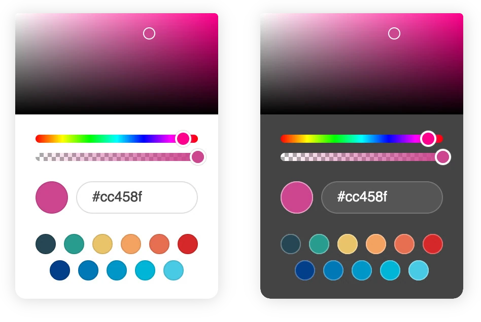
Multiple themes, color formats, and configuration options.
Built with accessibility in mind, supporting keyboard navigation and screen readers.
Optimized for touch devices. Usable on tablets and smartphones.
Works on all modern browsers with JavaScript support.
Try different configurations and see Coloris in action
Coloris({
  onChange: (color, inputEl) => {
   console.log(`The new color is ${color}`);
  }
});
Options with default values are omitted. More configuration options are detailed in the documentation.
Download the latest version from GitHub and add the script and the style to your page.
<link rel="stylesheet" href="coloris.min.css"/>
<script src="coloris.min.js"></script>
Alternatively, you can include the script and the style from a CDN (not recommended in production).
<link rel="stylesheet" href="https://cdn.jsdelivr.net/gh/mdbassit/Coloris@latest/dist/coloris.min.css"/>
<script src="https://cdn.jsdelivr.net/gh/mdbassit/Coloris@latest/dist/coloris.min.js"></script>Add the data-coloris attribute to the input fields you want to convert to color fields.
<input type="text" data-coloris>You can customize the appearance and behavior of the color picker.
Coloris({
  onChange: (color, inputEl) => {
   console.log(`The new color is ${color}`);
  }
});